Horror Book Cover
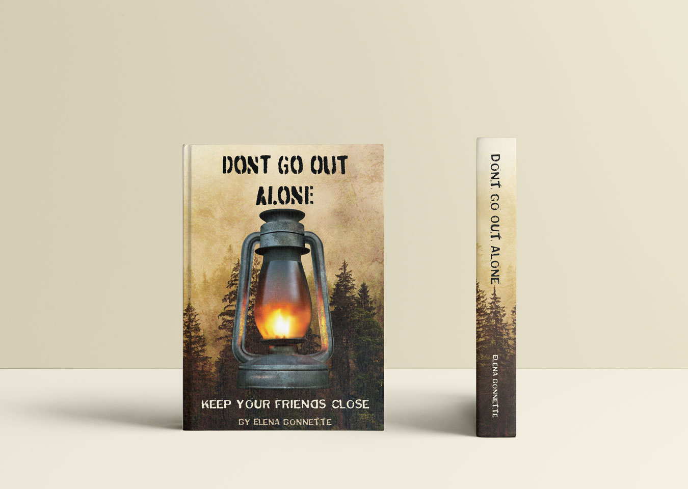
This book cover is a gradient mesh. I started with a reference image of a lamp and laid the mesh over top of each individual part. I then adjusted the different sections of the mesh to make the colors blend more naturally. I sampled the colors from the reference photo and made adjustments for them to flow more naturally together. I then imported the lamp from Illustrator to Photoshop and started to add texture through various brushes and blend modes. I sought and found the background forest image. I made it more grungy in Photoshop, also using brushes and blend modes. I then put both images into InDesign for the type layout. For the title, I used a typeface called Dirtstorm because of its texture and its typewriter-like appearance. I used the secondary typeface of Puddleduck because of the eerie feeling it conveyed. For the body copy on the back, I used an easier to read typeface called Amarante that still gives the impression of dread that the cover evokes. The lamp gradient mesh was placed in the center of the front cover to establish importance. The title was placed above it and in the largest font size for hierarchy, with the tagline and author name in descending size to continue this hierarchy. For the back, the book description is in a readable size, while the reviews are in a larger size to emphasize them.

